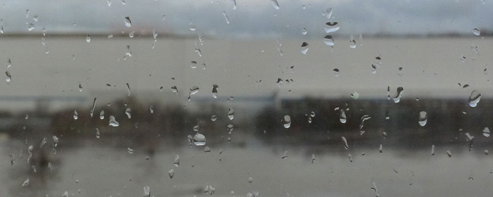
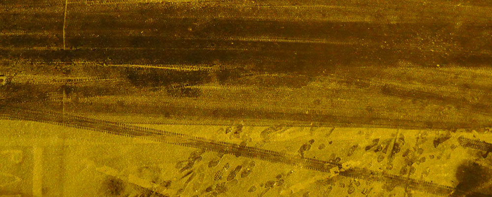
Many have lamented the shrinking of the album-cover canvas that accompanied the shift from LP to CD, but few have done anything about it. Jon Wozencroft, on the other hand, in his innovative typography, design and packaging for labels like Apollo, ~Swim, and above all Touch, the experimental music label he runs with Mike Harding, has refused to give in to the design coffin of the jewel case. There’s no single look to a Wozencroft release, but you’ll know one when you see it. Pan Sonic member Mika Vainio’s Kajo, for instance, tucks the disc into a lovely, matte cardboard pack adorned with cryptic images – a still life for the front, murky landscape on the back; further untranslatable landscapes are revealed inside. Or consider Fennesz’s bafflingly titled Plus Forty Seven Degrees 56’ 37” Minus Sixteen Degrees 51’ 08”, cased in an oversized folder depicting pastoral landscapes – images seemingly quite at odds with the dissonant machine complaints of the recording.
In a chain-store world, the decision to package a compact disc in a 4”x6” cardboard folder, rather than the industry-standard jewel-case, is a minor refusal, a gesture of dissent that suggests, almost synechdocally, a vaster plan for working against the grain. And the music presented by Touch, running the gamut from pop to noise, operates hand in hand with Wozencroft’s subtly subversive packaging and design.
At this year’s Sonar, the annual electronic music festival in Barcelona, Wozencroft presented a sort of “greatest hits” showcase. On a sweltering summer afternoon, 60 or 80 listeners lay back in reclining beach chairs while Wozencroft guided them through a history of the label-that’s-not-a-label. Despite the predominance of sweeping drones from artists like Biosphere and the Hafler Trio, you couldn’t really call it an ambient set – colliding Ryoji Ikeda’s sine-wave water-torture into dancehall reggae, in turn careening Scala’s four-dimensional pop into an archival blast from proto-post-punkers Wire, the mix stood in stark contrast to the seamless morphology practiced by most DJs. Wozencroft’s set highlighted the contradictions at the core of the “difficult listening” scene by challenging one of its givens: the immersiveness of sound. Highlighting chafe over flow, Wozencroft gave new meaning to the term “soundclash,” even as he preserved, minus the label’s essential visual component, the signature of the Touch experience.
How does Touch differ from your typical, multinational record label?
When we launched it, we envisioned Touch as the world’s first “audiovisual” label. We repeat, endlessly, “Touch is not a Record Label!” We work on Touch all the time whilst having to make money from other sources. We do not get grants or any other financial assistance. We depend more or less on a long-developed support system with the artists with whom we work and the key people who act as our antennae. It’s all based around collaborations. We publish music and artworks in small editions just as a printmaker or photographer might make an edition of their work to sell in a gallery. Except we have to put up with the vagaries of the distribution system open to us, and its perception of where we should “fit” – or not.
What makes Touch, well, Touch?
Its aura. Walter Benjamin proposed that mechanical reproduction had destroyed the “aura” of the original work of art. We propose that this might not necessarily be the case. As an equation, Touch represents an inverse relationship between the amount of resources and the scale and commitment of the project. I think what makes Touch pretty unusual is that we have maintained a dialogue and a narrative through our work over nearly 20 years that is growing stronger and stronger. For some reason I have never been able to fathom, Touch makes commercially-minded people very nervous. It’s the perceived need to put something into a box that doesn’t want to go in a box. It’s not petulant. We just want something more intelligent, more considerable. If I were to say what made Touch Touch, perhaps it is simply understated passion. But then that’s no different than 101 other small labels. So you tell me. I’m repeatedly struck by the way that density figures as a recurring motif, both sonically and visually.
The density comes from the first definition of art, which is to give structure, form and expression to lived experience in a way that radiates far beyond its source. The density comes from taking time and care over details that many would not bother with – a very close attention to the art of editing. And as an art in itself, editing is barely out of its diapers, and needs to grow up very, very quickly. At this time, people don’t necessarily learn how to edit when they get, say, a camcorder and a DVD-iMac, they are simply encouraged to imitate. The computer has ushered in a karaoke culture. For want of a better way of putting it, Touch is also a moral statement and a demonstration of a certain standard, a way of viewing the world. On the surface, you can see that Touch dedicates a lot of attention to the design and packaging of its releases, but this is simply a way of communicating care, and the straight expression of the love of what we are doing. It’s a project about beauty; I can find myself working on it as a gardener would. I’m not about to lay it out on a plate, in the form of a “message,” and have it be another consumable item.
Whether as a designer or an educator, my role is to decide to what extent you can help anybody “break through the plastic.” I insist to my students it’s more important to show politeness and good grace to someone working at the checkout in the supermarket than it is to do something wacky in Photoshop. I’m both approachable and quite strict with the students I teach. Wallpaper is not an option. I see my role as being, first of all, a catalyst. Second, a receptacle of difficult-to-find information – but that information is not given away freely. Third, my role is to serve as a very good question. People need to ask better questions. I do think the current situation is quite critical, because the language of resistance has been thoroughly watered down and made into advertising, and my present students have no vocabulary of their own with which to move elsewhere. The “defeat of socialism” might actually be called “the triumph of celebrity.”
Are you a sound artist yourself?
Maybe, in the sense that I commission, sequence and create the transitions for all the material included on Touch compilations. Obviously, there’s a massive difference in the emotional effect of a one second gap and a five second gap between two pieces of music, so the role of silence is crucial. I do recordings credited as AER. These are similar in spirit to Chris Watson’s atmosphere recordings, with the crucial difference that Chris’ are essentially carefully prepared and meticulously documented situations and phenomena, whilst mine are more like “action paintings.” Generally, concerning any pretensions I might have towards music and sound art, I prefer to keep things very low profile, if not anonymous, because I’m happy to rest in the shadows of far greater musicians than myself. One of the aspects of digital media that concerns me is the supposition that, because everything from sound composition to moving image can be generated from the desktop workstation, then anyone can do it, and should do it. It’s a nightmare, an ecological problem of the first order. Most of the graphic designers I teach these days want to make films, or make a CD, or both, and there’s no stopping them. I just tell them that when the time comes, they should hope they don’t get a heart surgeon whose previous training was as a plumber. Neville Brody and I used to joke that graphic designers would be the plumbers of the 21st century, fixing leaks on the dodgy pipes of corporate communication, and charging a fortune for the privilege. I would actually love to be proved wrong on this point.
Is there a typical working method in selecting images for your covers?
The music is the leader. First, become familiar with the music – ingest. Then, what is it in this particular composition, that suggests a subject I can move with? Forms of travel feature a lot in my photographs. A fruitbowl, a still life, is itself a form for travel.
Why so much landscape photography?
It’s a response to the tyranny of the close-up of the human face, for one thing. So it’s also a response to a sexual question. Next, it’s based around a feeling I have about sacred images. It’s the way that, as a subject, “natural” landscapes can invoke wonder and respect, which hopefully feeds back into human behavior. There has to be a way that images can teach, but all the didactic methods have failed in the face of mass media, so my concern is to find a language that is the opposite of meta-this, techno-that, and try to get to elemental concerns in a softer way. These landscapes are atmosphere recordings, and they are forensic. When I really started making photographs, at the beginning of the 1990s, I started by photographing material that I’d shot on video off the TV screen. I worked a lot on what could be done with abstraction, and as soon as the PC made it so easy to output abstraction, I decided it was time to make the subject central. And it seemed to me that photography could take the opportunity that Photoshop offered to sleigh off its skin. Maybe documentary photography, and a painterly approach to the medium, could be combined with a choice of subjects that were non-representations. It is the camera, it is the moment, but alongside a series of other processes parallel to the mechanical aspect that make it unique to the viewer, and the only manipulating factor is the light. Questions for the eyes, based on beauty. Saturated beauty.
Your name is well-known in the context of typography. Have you moved away from it?
No, I give typography the same care and attention as any other aspect of Touch. Right now, this aspect is quite understated. However, there was a time, let’s say between 1988 and 1995, when typography was the perfect medium through which to explore issues relating to literacy and visual perception – how the advent of the personal computer might be mutating the traditional structures and processes of visual language. I wrote two books about this, centered on the design work of Neville Brody, with whom I started the FUSE project in 1990. FUSE publishes experimental typefaces and encourages designers to extend/adapt/reinvent the basic form of the Roman alphabet, as a means of promoting a new understanding of the way those forms color every communication. We also wanted to create a forum that extended the work William Burroughs and Brion Gysin had done with cut-ups in the 1960s. Early 1990s typography was a vivid demonstration of their contention that “language is
a virus.” Raygun was the apogee of this, where David Carson could replace a writer’s words with dingbats and have everyone believe this was “radical.”
So, my question is almost ridiculously predictable: You run a label based on difficult music, hard to procure and tougher to learn about, packaged in fairly subtle design. Does your aesthetic work have any relation to your personal concerns for social justice?
I’m gently outraged by the way our culture has sought to erase any engagement with “difficulty.” Difficulty is crucial, and ever-present. What could be more difficult than the moral questions posed by genetic engineering? Corporate culture refuses difficulty in favor of infantilism. The reason why Touch is the way that it is has loads to do with “the political economy of music,” but it’s also trying to maintain the need to “find out,” rather than to be spoon-fed. Difficult can be dark. With the dark, it is necessary to adjust your eyesight, your mode of vision. But it’s not unaware of the need for entertainment. I just insist that it’s crucial to create a context where long-term strategies and objectives will reveal themselves to those who pay attention, which is not much to ask from a person who seeks to learn something, but a hell of a lot to ask from a culture that wants to be mindless. As Buckminster Fuller wrote in 1969, all part of the ongoing struggle between “Utopia” and “Oblivion.”


